

Download Dataset Here
WATCH FULL VIDEO HERE
Microsoft Power BI helps transform this raw data into interactive dashboards and reports that make complex information easier to analyze.
One practical way to learn Power BI is by building a real-world Amazon Sales Dashboard. This type of project can help learners understand the complete Power BI workflow — from preparing data to creating visualizations and extracting business insights.
What Is an Amazon Sales Dashboard?
An Amazon Sales Dashboard is an interactive Power BI report that presents important sales information in a visual format.
A well-designed dashboard can display information such as:
- Total Sales
- Total Profit
- Total Quantity Sold
- Sales by Market
- Sales by Region
- Monthly Sales Trends
- Sales by Product Category
- Quantity by Sub-Category
- Profit by Sub-Category
- Product and category performance
Instead of analyzing hundreds or thousands of rows manually, users can use charts, filters and interactive visuals to understand the data more efficiently.
Why Build a Sales Dashboard in Power BI?
Power BI provides tools for connecting data, transforming it, creating data models and building interactive reports.
TTS's Power BI course covers areas such as data connections, data modeling, dashboards, visualizations, report sharing and DAX.
A sales dashboard project can therefore be used to practice several important Power BI concepts within one project.
1. Data Preparation
Before creating charts, the dataset needs to be checked and prepared.
Typical data preparation activities include:
- Removing duplicate records
- Handling missing values
- Correcting data types
- Renaming columns
- Cleaning product names
- Formatting dates
- Creating useful columns
- Removing unnecessary fields
Power Query in Power BI can be used for many of these data transformation tasks.
2. Data Modeling
Data modeling is an important part of creating a reliable Power BI report.
For an Amazon sales project, you may have information related to:
- Orders
- Products
- Customers
- Categories
- Regions
- Dates
- Sales
- Profit
- Quantity
The tables can be structured and related so that Power BI can correctly analyze the information.
A proper data model can also make your reports easier to maintain and your calculations more reliable.
3. Creating DAX Measures
DAX, or Data Analysis Expressions, can be used to create calculations and measures in Power BI.
For example, a sales dashboard may contain measures for:
Total Sales
Total Sales = SUM(Sales[Sales])
Total Profit
Total Profit = SUM(Sales[Profit])
Total Quantity
Total Quantity = SUM(Sales[Quantity])
These measures can then be used across different dashboard visuals.
Learning DAX is particularly useful when moving from basic Power BI reports toward more advanced data analysis.
4. Designing the Power BI Dashboard
Once the data model and calculations are ready, the next step is dashboard design.
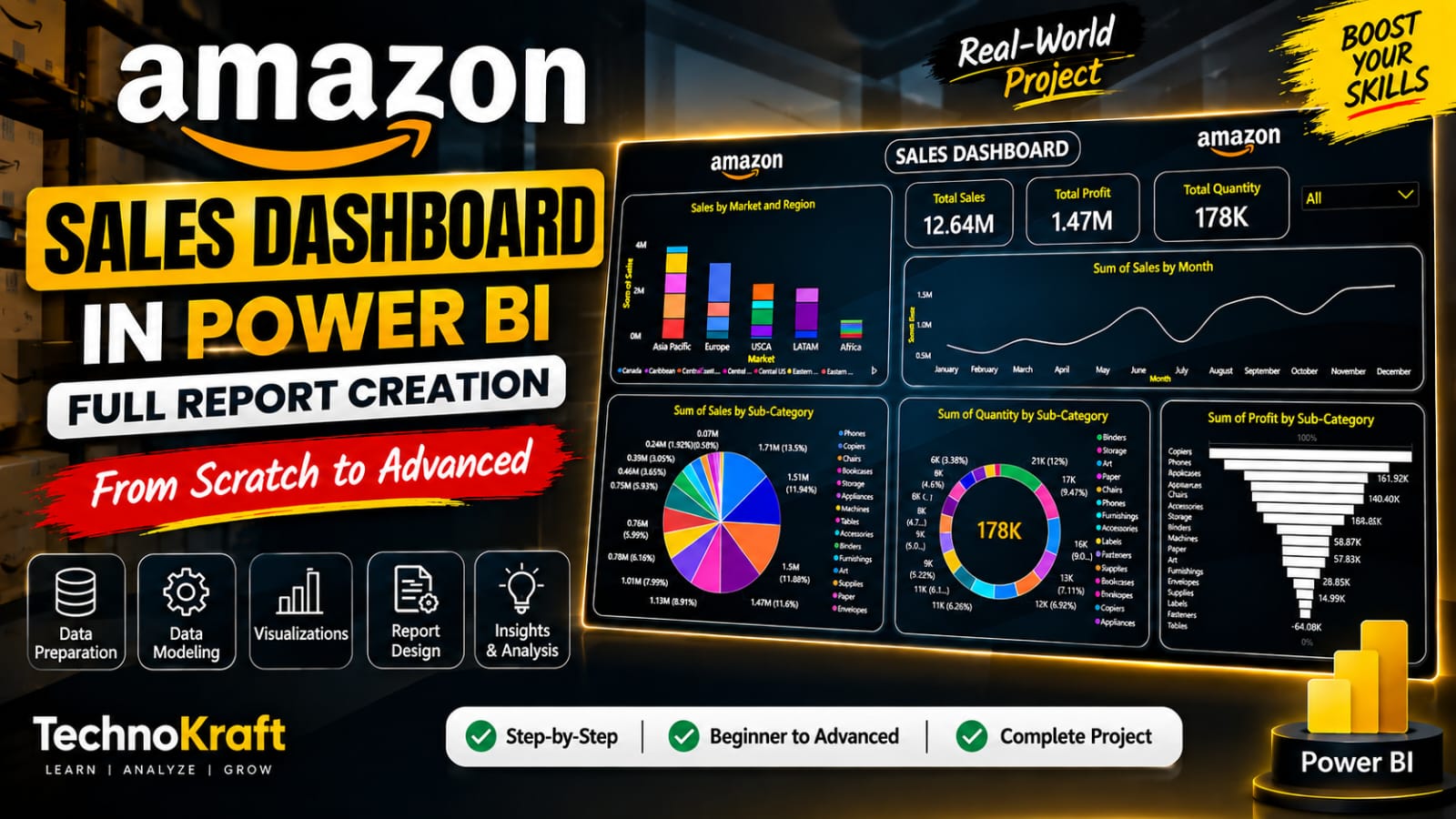
The example shown in the creative uses multiple visual elements to create a sales analysis dashboard.
KPI Cards
KPI cards can display important business metrics such as:
- Total Sales
- Total Profit
- Total Quantity
These provide a quick overview of overall performance.
Sales by Market
A column or bar chart can be used to compare sales across different markets or regions.
This helps users identify areas contributing significantly to overall sales.
Monthly Sales Trend
A line chart can display sales performance across different months.
This makes it easier to identify:
- Growth trends
- Declining periods
- Seasonal patterns
- Monthly fluctuations
Sales by Sub-Category
A pie or donut chart can be used to visualize how sales are distributed among different product sub-categories.
Quantity Analysis
A donut chart or bar chart can show the quantity sold across product categories.
Profit by Sub-Category
A bar chart can help compare profitability between different product sub-categories.
This can provide a different perspective from simply looking at sales.
5. Adding Interactive Filters
One of the major advantages of Power BI is interactive filtering.
For an Amazon Sales Dashboard, filters can be created for parameters such as:
- Market
- Region
- Category
- Sub-category
- Product
- Month
- Year
For example, selecting a particular market can automatically update the charts and KPIs on the dashboard.
This allows users to explore the dataset without creating separate reports for every category or region.
6. Extracting Business Insights
A dashboard should do more than display numbers.
The objective is to turn data into useful insights.
For example, an Amazon sales analysis could help identify:
- Which market generates the highest sales?
- Which categories sell the most?
- Which products generate the highest profit?
- Which months have stronger sales?
- Which sub-categories have lower profitability?
- What percentage of total quantity comes from individual categories?
These questions demonstrate how Power BI can be used for business intelligence and data-driven analysis.
TTS's Business Analytics curriculum also focuses on data visualization, descriptive analytics, predictive analytics and extracting meaningful insights from business data.
Who Can Learn Power BI?
Power BI can be useful for students, freshers and working professionals who want to develop data analytics and business intelligence skills.
It can be particularly relevant for:
- Students
- Recent graduates
- Data analysts
- Business analysts
- MIS executives
- Finance professionals
- Sales professionals
- Operations professionals
- IT professionals
- Working professionals looking to upskill
TTS's Data Analytics program also includes Power BI among its data visualization technologies.
Learn Power BI With Real-World Projects
Learning Power BI through practical projects can help you understand how different concepts work together.
Instead of learning only individual features, a project such as an Amazon Sales Dashboard lets you work through a complete workflow:
Raw Data → Data Cleaning → Data Modeling → DAX → Visualizations → Dashboard → Analysis → Insights
This project-based approach can help learners understand how Power BI is applied to real data-analysis scenarios.
TechnoKraft Training & Solution offers a Power BI course in Nashik covering basic to advanced Power BI concepts, including data connections, data modeling, dashboards, visualization, sharing and DAX.
Start Your Power BI Learning Journey in Nashik
If you want to learn Power BI through structured training and practical projects, explore the Power BI Course at TechnoKraft Training & Solution.
Related TTS pages:
- Power BI Course in Nashik
- Data Analytics Course
- Business Analytics Course
- All TTS Courses
- Contact TechnoKraft Training & Solution
TTS's website currently lists Power BI, Data Analytics and Business Analytics among its training offerings and provides classroom-oriented training resources for learners in Nashik.
Building an Amazon Sales Dashboard in Power BI is a practical way to understand the complete data analytics workflow. From data preparation and modeling to DAX, visualization and business insights, the project brings multiple Power BI skills together in one real-world scenario.
For students and professionals looking to develop practical Power BI and data analytics skills, project-based learning can provide useful experience in creating interactive dashboards and analyzing business data.